2.10.2012

using dingbat fonts to create cut files

I promised an easy tutorial for using dingbat fonts to create files suitable for cutting and I assure you this IS easy. Don't let the excessive number of screenshots deter you - I just wanted to be thorough!

Let's get started. I use PSE for your reference.

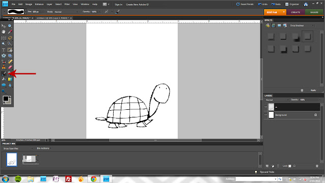
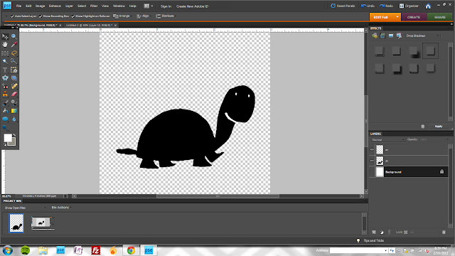
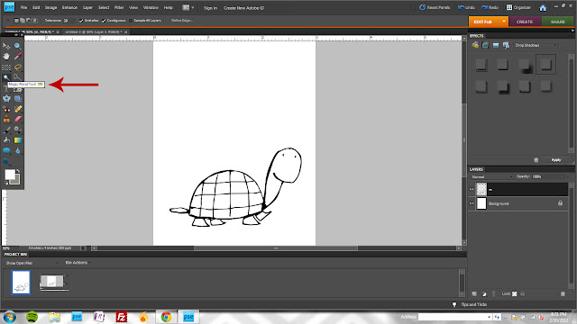
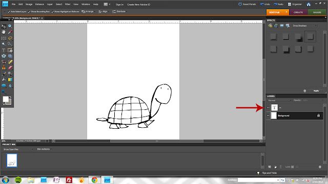
1. Start by choosing your font and image (this turtle is from DW Boys will be Boys - letter "m") Try to size it approximate to the size you'll be cutting and when it doubt, go bigger. Your quality will always be better downsizing rather than upsizing.

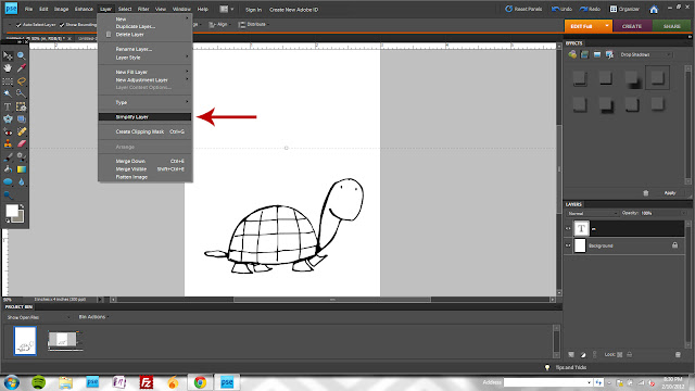
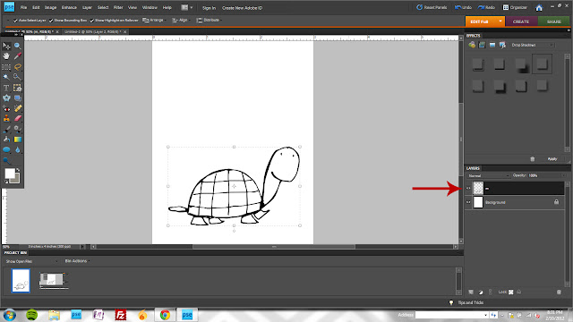
2. Next, "simplify" the layer (Layer>Simplify Layer OR right click on the layer in the layers palette and choose "simplify layer.")

3.  This shows how the layer thumbnail appears after simplifying.

4.  Choose your Magic Wand Tool (W) and click on your canvas anywhere *outside* of the image outline. NOTE: If there are any breaks in the outline, you'll need to close them. I'll show how to do this at the end of the post.

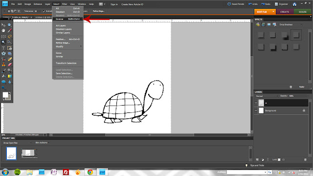
5.  Click shift + ctrl + I (or Select>Inverse) to reverse your selection area.
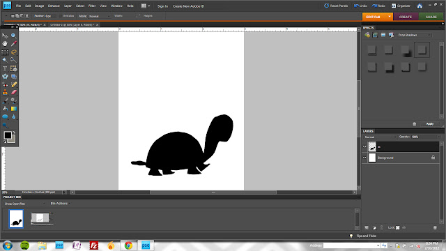
6. Activate your brush tool (B.)
7. Make your brush HUGE and stroke over the selected area.
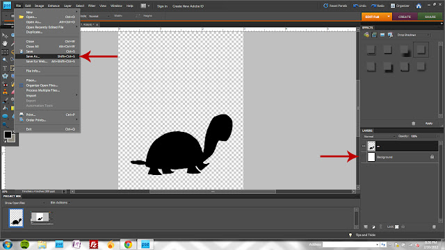
8. Hide your background layer (click the eye icon) and click File>Save As (shift + ctrl + S.) Save the image as a png file - this will allow you to open and trace in your Silhouette (or other? not familiar with other machines) software.


Now that you have a basic understanding of creating your png file, I'll show you an easy way to add a bit more detail.

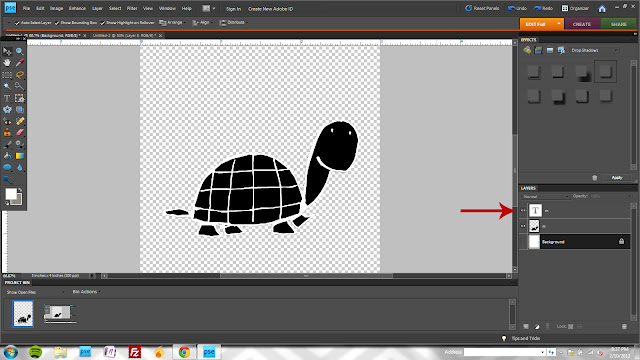
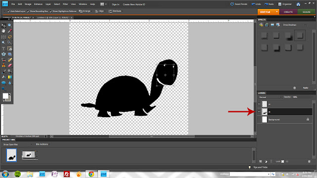
9. I layered a copy of the turtle image over the simplified, black layer.
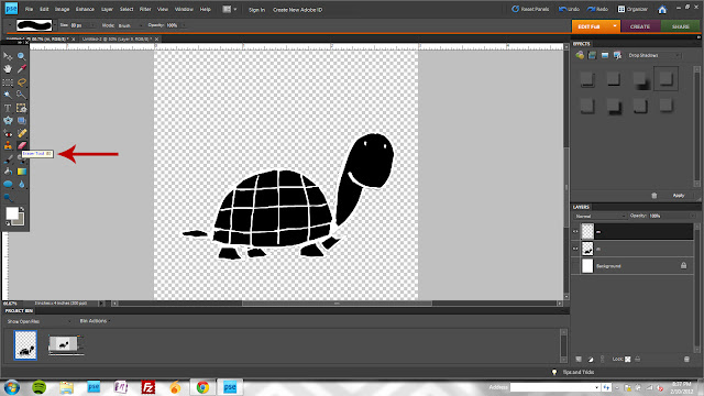
10. After simplifying the new layer, activate your eraser tool (E.)
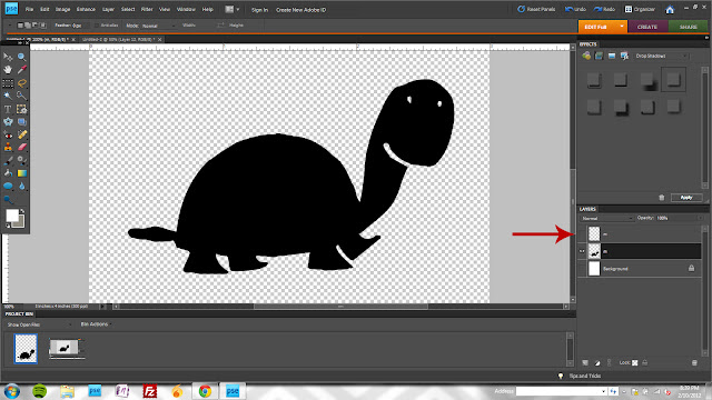
11. Next, I erased all of the image except for some basic detail that I thought would add to the final product (eyes and a mouth help, right?)
12. With the black layer selected, hold your ctrl key and click on the thumbnail for the top detail layer. This will create a selection area ("marching ants") for the eyes and mouth.
13. Hit the delete key to remove the detail from the black layer and hide the top layer by clicking the eye icon. Save as a png file as directed previously.
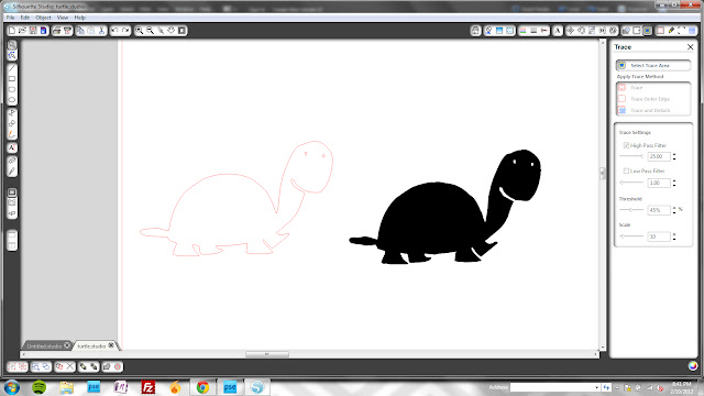
This screenshot shows the trace image in the Silhouette software (the turtle kind of turned brontosaurus in the process but you get the idea ;)

And finally, to show you how to close gaps in your outlines.

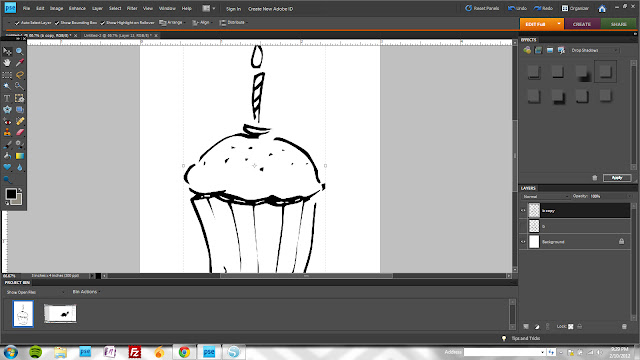
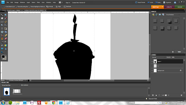
Again, start with your dingbat ("b" from the DW Make A Wish font) and simplify.
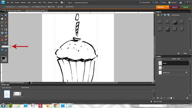
Activate your brush tool (B) and change the brush size to something fairly small (I was around 8 or 9 pixels.)
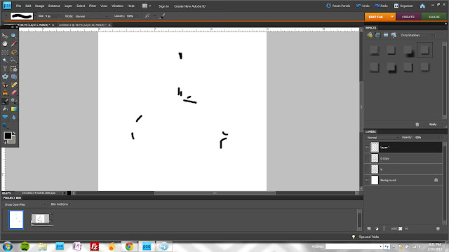
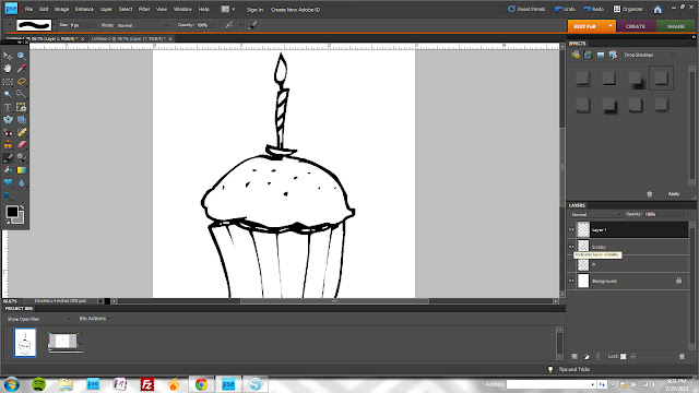
Fill in all of the gaps in the outline. No need to be super precise about this. However, I would do this on a new layer for now (the new layer icon is the first icon located on the bottom of the layers palette.)
This show just the new layer with the brush marks I created to close the gaps.
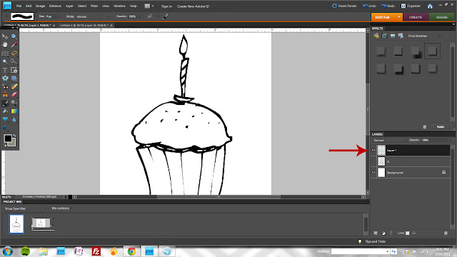
Once you're satisfied that the gaps are filled, merge both the image layer and the brush layer (select both layers by holding the shift key and then click ctrl + E)

After coloring the dingbat.
And after adding a bit of detail back in.


There are really SO many possibilities with dingbats. And the best way to learn how to do it is to simply play. If you have questions, leave them in the comments and I'll do my best to answer :)

2.09.2012

blog graphics


Morning all! It's a beautiful, sunny day here and I'm convinced that it's going to be a great day. I have my favorite mug (a result of the school Christmas store + Jake's careful choosing a couple of years ago) and the morning went off without a hitch. "Productive" is the adjective I'm most hoping to be able to use to describe my day when it meets it's end.

A couple of weeks ago, I helped my dear friend Mel by designing a few graphics for her blog and her recipe journal. I created a few different options and wanted to share with you the ones she didn't end up using. I have no interest at all in getting into the blog design business but since these are already designed, I figured I'd offer them up if anyone is interested in having them.

I know next to nothing about blog formatting but if you know what you need and you're interested in any of these, I will be happy to adjust the text, colors and size to fit your needs. I will also do any sidebars and/or post graphics to coordinate. $30 for all of the graphics in jpeg or $40 if you'd like the jpegs as well as layered, editable versions.

Just email me if you'd like to talk about any of them!

E

2.08.2012

creating an animated layout

A couple of weeks ago, we hit the mini hill behind my dad's house for some low-key sledding. Mostly, I helped Izzy climb the hill and then came back down with her on the sled but for her first solo trip, Jake helped her up so I could take a few pictures. While they aren't great, I still love the progression they show and wanted to somehow reflect that movement in layout form without sacrificing the size of the photos. So, I created the layout as an animated gif to share online.


It's really not all that difficult so I thought I'd do a quick tutorial on how I accomplished it (as I'm sure there are other, more efficient ways of doing it.)

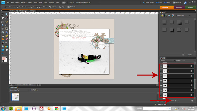
1. Create your layout as you normally would. I chose all of the photos I wanted included in the animation, numbered them in the order they would appear in the layout and locked them so that I could move them around as I designed the layout while keeping them in an identical position.

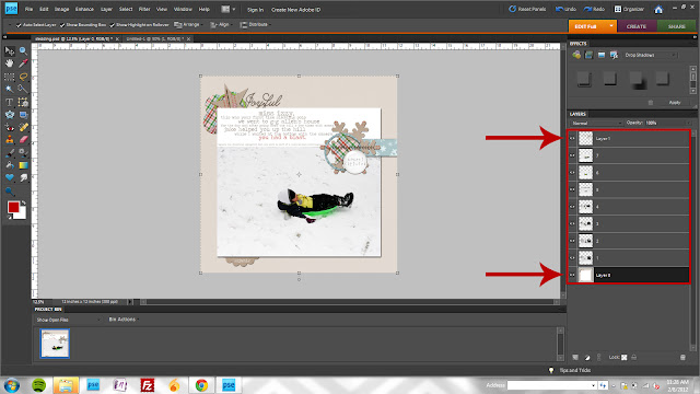
2. Once I was satisfied with the design, I merged all of the layers *above* the photo layers into one layer and all of the layers*below* the photo layers into another. So now, I have a total of 9 layers: 1 top layer, 7 photo layers and 1 bottom layer. (Of course you do all of this after you have saved your original, layered design! Do this on a copy or resave with a new name right away!) To merge multiple layers using keyboard shortcuts (I'm all about keyboard shortcuts,) select all of the layers above the photos (click the very top layer and then, while holding the shift key, click the last layer that appears just above the photos) and click ctrl + E. Repeat for all the layers below the photos.

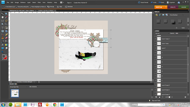
3. Next, you need to create duplicate copies of the background and top embellishment layers. You need enough for each photo so for me, I created 6 copies of each for a total of 7 layers above and below (21 layers in total.) ctrl + J is a fast method of creating duplicate layers.

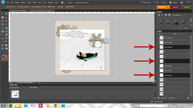
4. Now, you need to merge a top embellishment layer, a photo layer, and a bottom background layer for each of the 7 photos. Essentially, you are creating 7 identical layouts, each with a distinct photo. To select non-consecutive layers in the layers palette, hold the ctrl key (rather than the shift key you used in step 2.) Once you've selected the 3 layers, ctrl + E will merge them. Make sure the layers retain the numbers you assigned the photos previously.

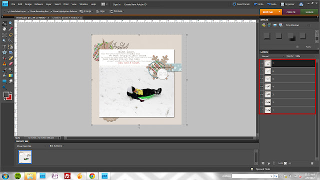
5. Once you're done, you'll have your 7 layout layers. They should appear in reverse order with the last photo appearing in the top of the layers palette.

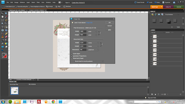
6. Now, you'll resize your layout. A full size 3600 pixel image is too large to convert to an animated gif (and unnecessarily large for monitor display anyway.) To resize, click alt + ctrl + I (or menu Image>Resize>Image Size) I changed my resolution to 1000 px.

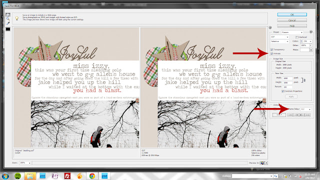
7. Finally, you'll save your layers as a gif. Choose File>Save for Web (or  alt + shift + ctrl + S.)   Make sure the "animate" box is checked and adjust your frame delay as desired. For this layout, I left it at the default .2 seconds. To preview your animation before saving, click the "preview in" icon at the bottom of the pop up box.
And obviously, this isn't something that can be captured once I print so for my album, I simply selected my favorite photo for use on the main page and then shrunk the rest for inclusion on a second, simple page.


I know my instructions could be better so if you have any questions on how I did it, just let me know!

2.07.2012

new today

Three new kits today - each designed to coordinate with the February Pea Soup color scheme:

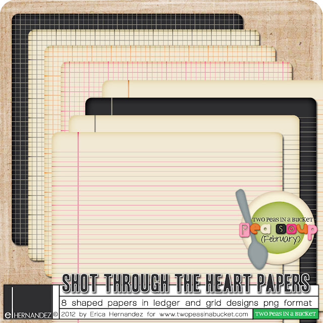
Papers - $2

Elements - $2

Alphabet - $2

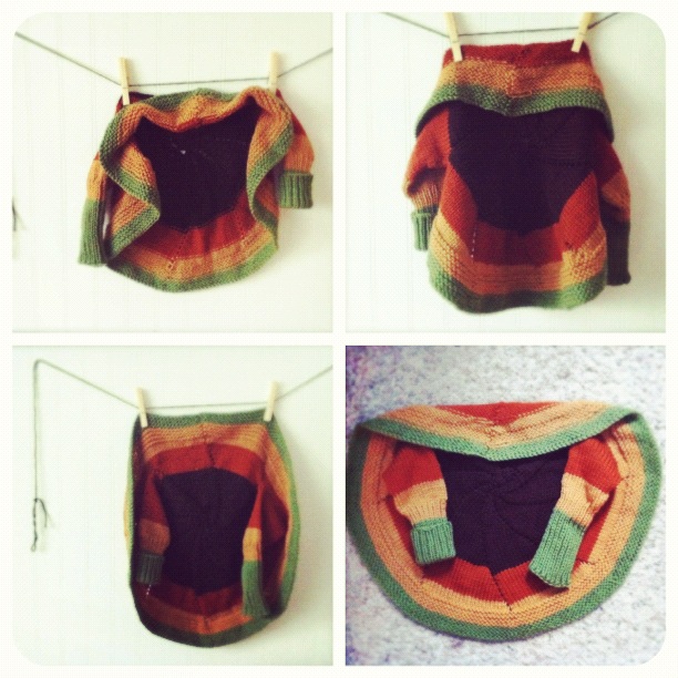
Also, a couple of weeks ago I had a craft day with my sister and step-mom and finally knocked out a few knitted projects that just needed ends weaved in and cleaned up. I started this little pinwheel jacket for Izzy when she was tiny but she grew so fast and it took me so long to do the finishing that she has loooong past outgrew it. I'd love for *someone* to get some use out of it so if you have a newborn or know someone that does and would like to have this, it's yours! I know these are terrible photos but I think you get the idea :)

One random commenter will get all 3 kits and the first person to claim the sweater owns it :)

2.03.2012

briefly...

  1. Thank you so much for all the supportive and encouraging comments yesterday. They mean more than you know. I wanted to respond to all of them individually but to be honest, I got kind of choked up reading them and when I attempted to respond, I got all verklempt. I hope you'll accept my sincere thanks in a post instead. I guess I didn't realize that I needed a little reassurance and empathy until I got it.
  2. The winner for my Tuesday release is:
So email me, Ellie!

I'm ready for the weekend. I WILL have some project life progress to share when it's over and maybe another freebie or two :) Enjoy!

2.02.2012

one day at a time


This kid, our middle, has proved to be the source of more consternation and confusion and guilt than any other person in my life. Ever.

It started around the time we move into a new house. And his big brother started going to school. And his little sister was born thus rendering him the middle. That doomed spot in the sibling line up. Little wonder he started reacting to all the turmoil, right?

He's gone through phases of anger and acting out. Throwing and breaking things. Hitting and pushing and saying things we know he doesn't mean but still hurt as if he did.

Sometimes he is the most thoughtful, giving kid you'd ever want to meet.

We took him to a child psychologist who assured us his behavior wasn't abnormal (and that we were handling it in an appropriate way - our biggest worry.) We were relieved to find out she didn't feel it was something medical or psychological or something that he wouldn't eventually grow out of with patience and love and perseverance.

Still though. This is some tough stuff. One of our greatest sources of pride in this little wonder though, has always been, that at school, he excels. In every sense of the word. Academically, he surpasses every expectation. With every teacher meeting, we're congratulated on his behavior and rule abiding nature and desire to help his classmates.

Phew.

And so, when he's at school, it's like a reprieve for us. Knowing that he's happy and successful and safe and challenged for a few hours every day.

This year though, he's had a couple instances. Minor in the scheme of things but evidence of a crack in our beliefs about when and where and how this "thing" affects him. He's not infallible. We should have known this. Why didn't we plan for this?

Throughout the past 4 years or so, we've worried so much. About the right way to approach different situations. About how long to stick with a course of action (trying to walk that fine line between "long enough to make and impact" and "this obviously isn't working.") But this kid; he is stubborn, obstinate, persecuted, blaming, manipulative, inflexible. And SMART, intuitive, curious, thoughtful, logical. He is so much bigger than his tiny little body would have you believe.

So these instances. They stem from insecurity, a little bit. Kids who can sense vulnerability in him and play upon his microscopic weaknesses when his strengths are so big. And he falls for it. We're working on it. He'll be a super star someday. It's our job to keep his heart safe in the meantime. So, to help him deal with his intolerance for those small-minded kids, we provide consequences for his bad choices. But more than that, we try to teach him that these are just tiny little blips on his radar. To be bigger and and act better. To take responsibility for himself because his choices dictate his success. Not their choices.

Each morning for the past few days, I've drawn a tiny Sharpie heart on the palm of his hand. Something secret and special that he can peek at when he's frustrated and needs guidance. A reminder that we love him. We believe in him. And we expect him to make good choices. All the time, not just when someone is watching. And so far, it's worked. He's gone to school with confidence and come home with a smile.

This kid makes my heart so full. And now I'm crying. Sorry for the ramble. Sometimes, you just need to get it out.
1.31.2012

new today

Two new kits today.
Love Song Journaling Cards - 10 designs in b+w and color as well as additional brush images $4
Chevol Paper Pack - 12 papers $2.

On Friday, I'll select one commenter to win both kits!

ALSO, Two Peas is having a 20% off sale on a huge variety of Valentine and love themed kits today through Monday the 6th INCLUDING my new Love Song cards.


Also on sale, My Funny Valentine Brush Set and Love is in the Air Mini Kit.


1.27.2012

project life...in progress

I'm working on a more substantial project life post but part of the process I'm slowly developing includes using some pre-made photoshop templates for planning my pages. I'm doing a mix of traditional/hybrid/digital but since the beginning of time (or, since the beginning of my scrapping life, and long before I ever thought of digital scrapbooking) I've always planned pages in some type of editing program (way back when I first started...almost 10 years ago (!) I used Microsoft Picture It) before actually constructing them.

Marcy Penner has some fabulous printables for a variety of page protector styles. I downloaded them, printed them in a mini book format and bound them using this technique to toss in my purse - perfect for waiting in the car for the boys to get out of school!

Once I have a basic plan though, I need to work it out in Photoshop...adding the photos and text into the spaces until I'm satisfied. That's where these templates come in. I created these for the mish mash of We R Memory Keepers and Project Life template styles I picked up. There is a seperate png file for each of the 12 styles I have. I added a tiny margin to make sure they would fit once I printed and slid into the protectors. If you can use them, you can download here.

Also, the winner of my kit releases from this past Tuesday is:


Please email me Marty so I know where to send the files!

1.24.2012

new today and a quick tutorial

Three new [tiny] kits today...each just 99¢

Date Slims

Journaling Cards

Paper Mask

I'll give all three kits to one of you! Just leave a comment, any comment, and I'll choose a winner Friday!

Now, for the tutorial. I wish I could figure out how to get better at screen capture videos but screenshots will have to suffice. Also, I'm all self taught so I'm adding a disclaimer that my methods may not be the best or most efficient but they get the job done!

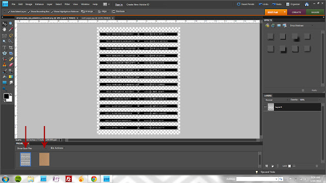
I designed those Date Slims because I wanted something that I could staple to the edge of my pl page protectors. Something that would add a little continuity and make it easy to find a specific week. I wanted *mine* to look like white ink on kraft paper though so I'm going to quickly show how I took the file from the Date Slims kit and modified to suit the look I was after. You can download my 8.5x11" kraft paper jpg HERE. Just an FYI that this kit includes a blank label file as well so you can customize the dates if you're working a different format than Sunday - Monday.

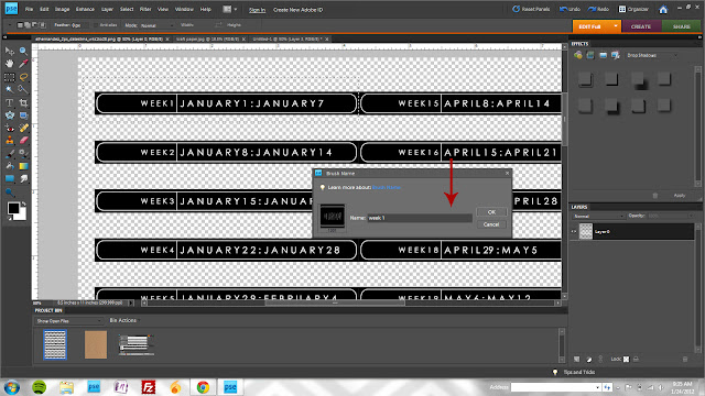
Open the date slims file and the kraft paper file.

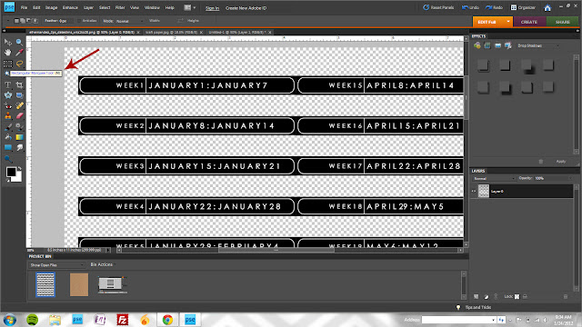
Activate the Rectangular Marquee Tool (keyboard shortcut M)

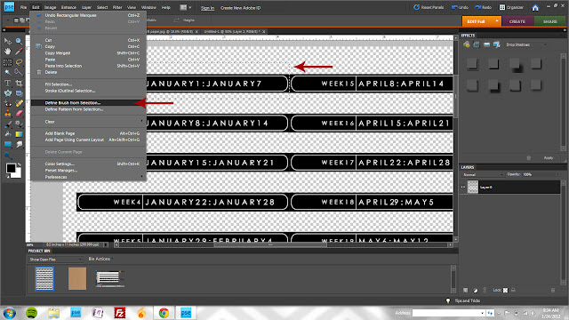
Draw a rectangle selection around week 1 and then click Edit>Create Brush from Selection

You can name your brush if you'd like but it's not necessary. If you're creating a lot of brushes at once (and especially if they'll look similar in a thumbnail like these week images will) then naming makes it much easier to identify the brush you want.

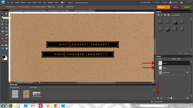
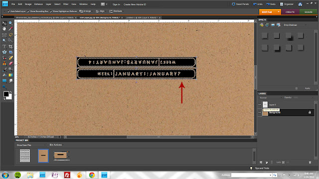
Switch to  your kraft paper file, create two new layers, and stamp week one and week two on separate layers.

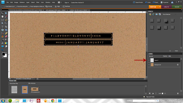
Rotate one of the layers 180° and position as shown.

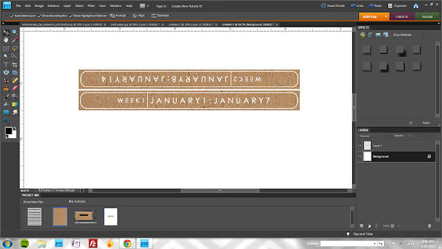
Merge both layers together by selecting both (hold the shift key while clicking on both layers) and clicking ctrl+E.

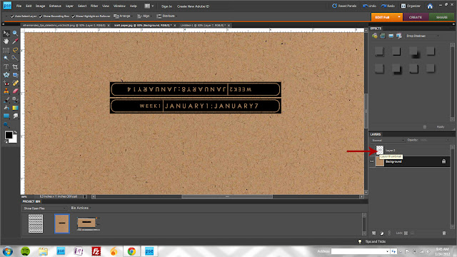
Select your kraft layer and while holding the ctrl key, click on the *thumbnail* image for the label layer (click on the actual picture - not the layer name)

At this point, you'll see the marching ants (animated dashed lines) that indicate you've made a selection. Click ctrl+J to create a copy of the date labels from the kraft paper.

Here you can see the new layer that was created in the previous step.

Drag your kraft layer to a new white canvas to print.


OK, so maybe not such a quick tutorial but I'm not a natural teacher and have a hard time figuring out the best way to demonstrate the steps. If you have questions, leave me a comment and I'll do my best to answer them!

1.23.2012

Chinese New Year

image from here
Today marks the beginning of the Year of the Dragon. An auspicious occasion since *I* was born in a previous dragon year. And we can all see how well that worked out for me :)

The Year of the Dragon is supposed to be the luckiest year in the Chinese zodiac. A time of great change and opportunity. I haven't shared a lot on this blog about our current situation but needless to say, we're due for some positive change and opportunity. I'm not superstitious, I don't believe in astrology, but in this case, I say bring it on Dragon!

Of course, we had to look up the zodiac sign for everyone. Turns out, the signs pretty closely mirror personality.
  • I'm the quick-tempered, independent loner Dragon.
  • Carlos and Izzy are the loyal, sociable, passionate pigs. (also, if you know anything about Izzy, this fits her on a gustatory level as well.)
  • Jake is the popular, quick-witted, talkative, anxious horse.
  • Zack is the inventive, inquisitive, factual, manipulative monkey (also fits him due to the fact that he is, indeed, a monkey! I find him hanging upside down off the top bunk of his bed pretty much daily.)
In honor of the day, we had to have Chinese for dinner. We tried a new recipe tonight and it is absolutely, without a doubt our new favorite and go-to tofu recipe. The original recipe came from here (totally making the scallion pancakes they have on their blog sometime soon...maybe the next time we have the general tso's) but I modified it a bit to make it vegetarian and use supplies I had on hand.

Yes, that's tofu!
Here is the recipe I ended up going with per my modifications:

2 T apple cider vinegar
1/4 C vegetable broth
1 T soy sauce
1 T mirin
2 T hoisin sauce
2 t sriracha
2 t sesame oil
3 T sugar
1/2 C cornstarch
1 block firm tofu (pressed for about an hour)
oil for frying
minced garlic (I don't have a measurement for this...go with what you like, I typically add a lot more than what a recipe calls for because I LOVE GARLIC)
1 T minced ginger
1 t red pepper flakes
3 chopped scallions (white and green)

  1. Marinate cubed tofu in apple cider vinegar for 15 minutes.
  2. Mix sauce ingredients: veg broth, soy, mirin, hoisin, sriracha, sesame oil, sugar and 2 t of cornstarch and set aside.
  3. Toss tofu with salt, pepper and cornstarch coating the cubes as uniformly as possible. Fry in a bit of oil until crisp. Keep an eye on it and give it a shake/stir often to make sure all sides brown. Drain on paper towel (I did my tofu in 2 batches so the pan wouldn't be too crowded.)
  4. Dump the remaining oil so that the pan still has a thin coating. Add the garlic, ginger, scallions and red pepper flakes sauteing for 30 seconds or so.
  5. Add tofu back to pan and stir in sauce to coat the pieces. The sauce thickens up quickly and turns into a delicious sticky coating.
  6. Serve with stir fried broccoli and brown rice.

Seriously, this was amazing. I strongly encourage you to make it...tofu or chicken or even beef would be great if you're a meat eater. Or, just make some of the sauce and spoon it directly into your mouth.

1.20.2012

kit winner

Congratulations


Please email me and let me know which new release kit you'd like!

1.19.2012

project life stash builder one


So, since I'm tackling project life from scratch and not using a kit, I have a lot of work to do to build up my stash of page building elements. This is a super quick and easy way to dress up plain labels. I plan on using these to date and caption photos.
  
1. Grab some label sheets.
2. Arrange your labels on a sheet of printer paper.
3. Open your grid file (I saved this one as a PDF - you can download it from here if you'd like)
4. Print as usual. You're done! I threw a sheet of those hole reinforcements on just to see how they'd turn  out. Kind of fun...I'm sure I'll be able to work them in somewhere.


LinkWithin

Related Posts Plugin for WordPress, Blogger...