I don't very often make the time to scrap for myself any more - my own issue that I need to work to overcome more frequently. I took this picture of Izzy the other day though and figured it was time for an update layout (yes, the boys are overdue as well but she's just so darn handy!)
I know chevron is all over the place (it's everywhere in my own kits as well) and I'm so good with that. For this layout, I wanted a subtle color shift though so I combined chevron with another popular trend: ombre. It's a simple enough process in PSE.
 |
| Open your patterned paper and duplicate (ctrl + j) |
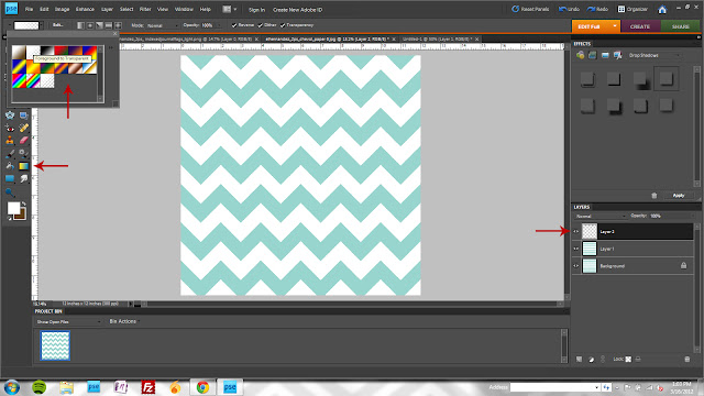 |
| Create a new layer, select the Gradient Tool (keyboard shortcut "G") and choose the "foreground to transparent" option. |
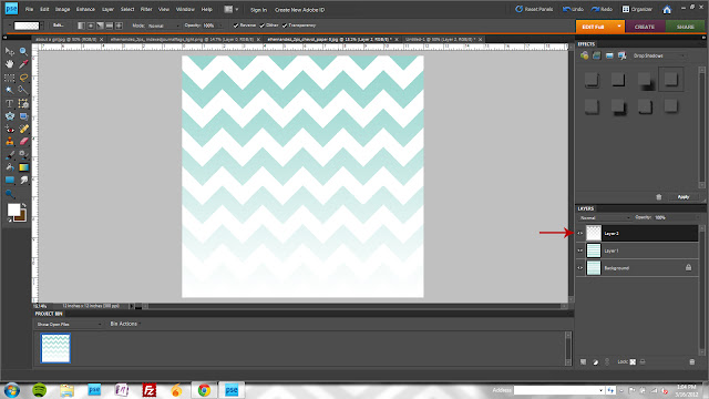 |
| With white as your foreground color, click and drag your mouse from top to bottom on your paper canvas. |
 |
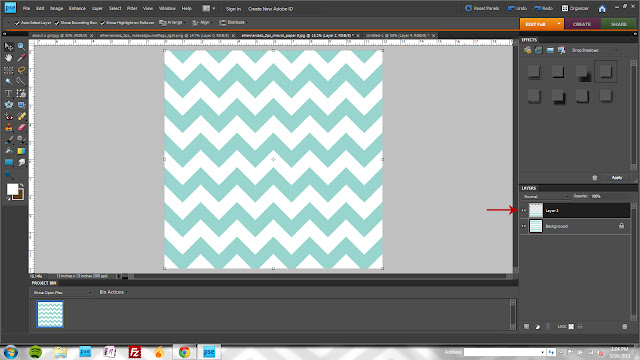
| Move the top paper layer above the gradient and merge down (ctrl + g) |
 |
| Merge permanently with ctrl + e |
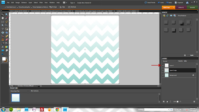 |
| Create another gradient layer, this time dragging bottom to top. |
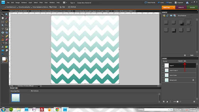 |
| Adjust the opacity of the white gradient (I used 85% to *just* allow the top chevron to show through) and duplicate the gradient chevron layer. Make both gradient chevron layers "multiply" mode. Flatten the image to use in your layout! |
Layout completely and totally inspired by an ad project I found in the
Make & Matter portfolio (remember rounding the corners of everything - layout background included? I loved that. Need to do it more.) And I used an old school font for the journaling - my all time favorite Autumn Leaves font: Uncle Charles.


this layout is so awesome. makes me wish i was still scrapping so much. and i can't get over how big she is. she's beautiful, e.
ReplyDeletecongrats - this layout and post has been featured on MSA's Everyday Inspiration blog:
ReplyDeletehttp://www.myscrapbookart.com/blog/?p=733